When browsing PhotoStructure on an Android smartphone, I expect to be able to see the name of the current folder.
Current Behavior
However it is truncated which means it loses value.
Steps to Reproduce
Using a mobile browser on Huawei P50 android phone in portrait orientation.
Navigate to PhotoStructure home
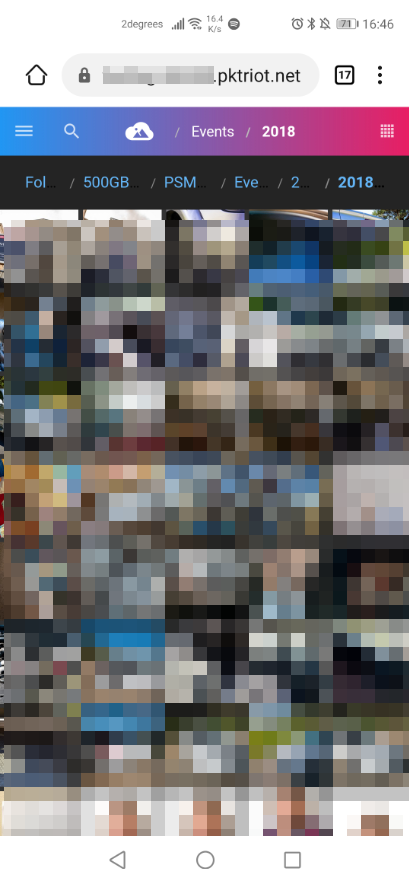
Go to Folder > (name of hard drive) > PSMedia (name of library) > Events > 2018 > 2018 My Favourite Event
You can’t really see the current folder name, it just shows as “2018”, rather than “2018 My Favourite Event”. Also the folder names in between are meaningless.
The folder names are shown in full if you rotate the phone into landscape. It’s only in portrait that they are truncated.
I would be happy if it just showed “PSMedia > … > 2018 My Favourite Event”. The important thing is the current folder name.
Reminds me I need to raise a request to get rid of the “500GB” and “PSMedia” root folders, I just want to jump straight to “Events” because that’s the first folder hierarchy in my PSMedia folder.
Environment
Operating system and version: Windows 10 host, Android 10 phone
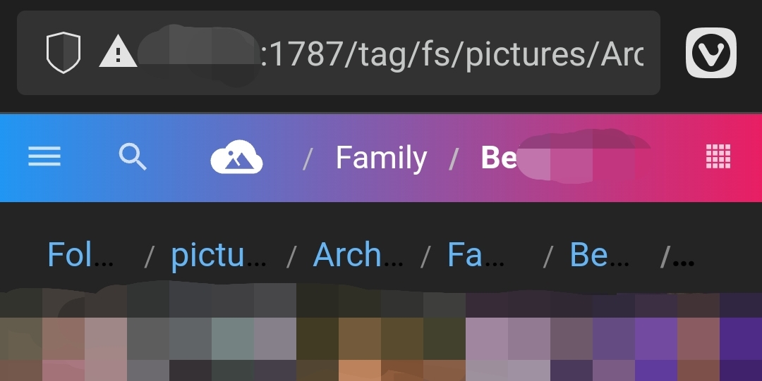
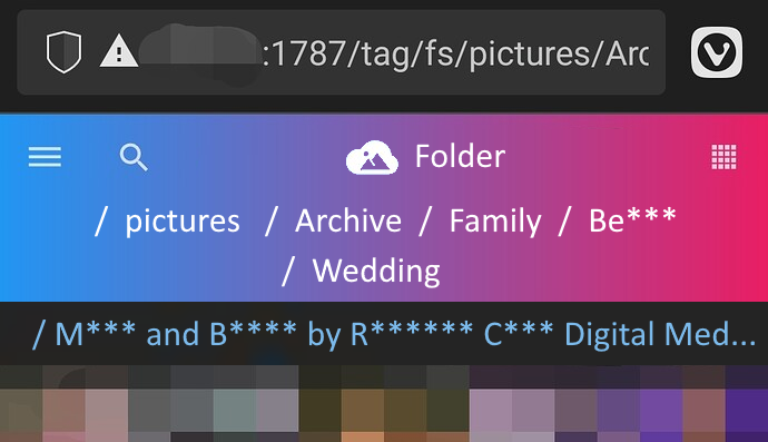
Note in my case the deepest subfolder name is cut off as well, which is the most useful info for me when drilling down into multiple folders.
Also the full subfolder path is redundant anyway with the the PhotoStructure header at the top of the screen. You’re already showing .../Family/Be***** at the top of the screen, so there’s no need to repeat the full path info for every single subfolder. It’s nice if the path is short enough anyway, but actively harmful for long paths.
It’s very good that breadcrumbs are clickable (see PhotoStructure | Post-installation #protips), so I suggest you add an extra line (s) to the global header as needed to avoid ellipses. Something like this:
I mucked with this a bit in v2.x to use CSS to get this job done: reverse grid layout truncation doesn’t seem to work quite right in all cases.
Agreed. I think in another topic we discussed replacing the elided directory names with a pulldown, similar to how the macOS Finder works.
The way it currently is is pretty bad: I was trying to avoid extra clicks, but I think it may be simpler and less “magick” if the pulldown/details panel always shows up on smaller displays.
How do you think I should handle crazy long directory names, like the one in your example?
Nice, guess we were both responding at the same time! Hopefully you saw my mockup above, I guess it sounds like you’re doing something similar in 2.x anyway
Thanks to @awojtas for reporting this issue. Apologies for the delayed follow-up.
We believe the mobile breadcrumb overlapping/truncation issue should be addressed by improvements made in v2026.2, and v2026.4 includes a broader set of mobile UI improvements (redesigned breadcrumbs with VS Code-style sibling dropdowns, mobile toolbar, PWA standalone/fullscreen mode, swipe navigation, and more).