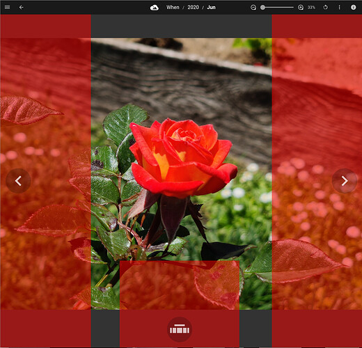
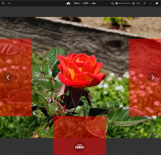
I don’t know if this is a “bug” per say but, when you open the info tab on a portrait photo, and then especially if you resize the window skinny, the left and right button active areas go into the photo quite a bit, this is kind of confusing because I was expecting to zoom when I click the image and in some cases I was going to the next image until I figured out what was going on.
I currently split the screen into thirds: the middle third is zoom.
I had it originally 25-50-25, and people on smaller screens would miss the forward/backwards buttons…
I think if I implemented swipe navigation, it’d make this less of an issue, perhaps?
Yeah the swipe navigation would be great on mobile. It’s a tough question to answer perfectly. Although my opinion would be for at least on desktop browsers clicking anywhere on the image should have the same behavior, not zoom in the center and forward/back on the edges. If the image could be layered over the forward/back click region (except where the arrow circle is) that would work well
Swipe would be awesome on mobile devices, actually the only thing the wife has complained about this faar 
My preference is to swipe left/right to navigate assets on devices that have touch interface; and to have small clickable areas for left/right navigation on desktops/laptops/web browsers/etc., where these clickable areas don’t move on the screen from one asset to the next (even if the asset is a different size or orientation or zoom level or file type or anything, don’t let those left- and right-arrow clickable buttons move around!), these clickable areas should be small (not 1/3 or 1/4 the size of the screen or the asset, but like a medium or large button that’s easy to click but not intrusive).
I’m thinking even smaller clickable areas. On a mouse-based device (i.e., not touch-screen), I’d want only those circles that are the visible buttons to be clickable, or perhaps as big as a circle with twice the diameter with the same center point as those circle buttons. I have no need for an “easy” mouse target in order to go to previous or next or to raise the Streams; in fact, it bugs me when clicking somewhere on the screen does something that I’m not expecting - I often click randomly (over areas of the screen that I anticipate should have no effect) as a fidget-y habit, and when screen areas are clickable I inadvertently end up clicking/doing something I didn’t intend. On a touch-screen device (e.g. phone), it might make plenty of sense to have large areas of the screen “clickable” - your finger isn’t always very precise and always cover what you’re trying to click on, so a small clickable target might be tough to hit on some devices. Of course, when/if you incorporate swiping for next/previous, then clickable areas of the screen should be removed anyway (swipe left/right for navigate left/right, swipe up-from-bottom for Streams).

