Update 2022-05-15: I looked into this solution a bit more, and both masonry and adaptive photo layouts suffer from cropping: it’s why I suspect Apple Photos simply maintains a square grid, and the mode toggle switches between css-style “cover” and “contain” modes.
If I go with this approach, this actually has a really nice side-effect: I only need to generate original-aspect-ratio previews, and rely on the browser to crop to squares, but still maintaining centering based on attention-analysis of the image content. This will halve the number of files PhotoStructure has to produce in the .photostructure/previews directory during asset file imports.
I’m curious how the method you linked to will handle thousands of images or resizing a window. I think you wrote somewhere else there is lazy loading coming up?
PhotoStructure already uses javascript-based lazy loading for tag galleries and search results: if you see the “load more” button, it’s because that browser doesn’t support the intersection API (mostly old versions of safari).
Adding my thoughts from a duplicate thread I created about this. Didn’t find this thread with my search for “square grid”, so hopefully my extra notes below about flexible thumbnails instead of just a square grid and specific examples help raise awareness of this existing thread. Thanks @mrm for the redirect!
Cropping photos into a square often cuts off important details like heads on portraits, whole people on landscapes, etc. It can completely ruin the original feeling of ultrawide panoramic photos, and eliminate loads of context from ultratall phone screenshots.
The current homepage offers three different sizes of a square grid.
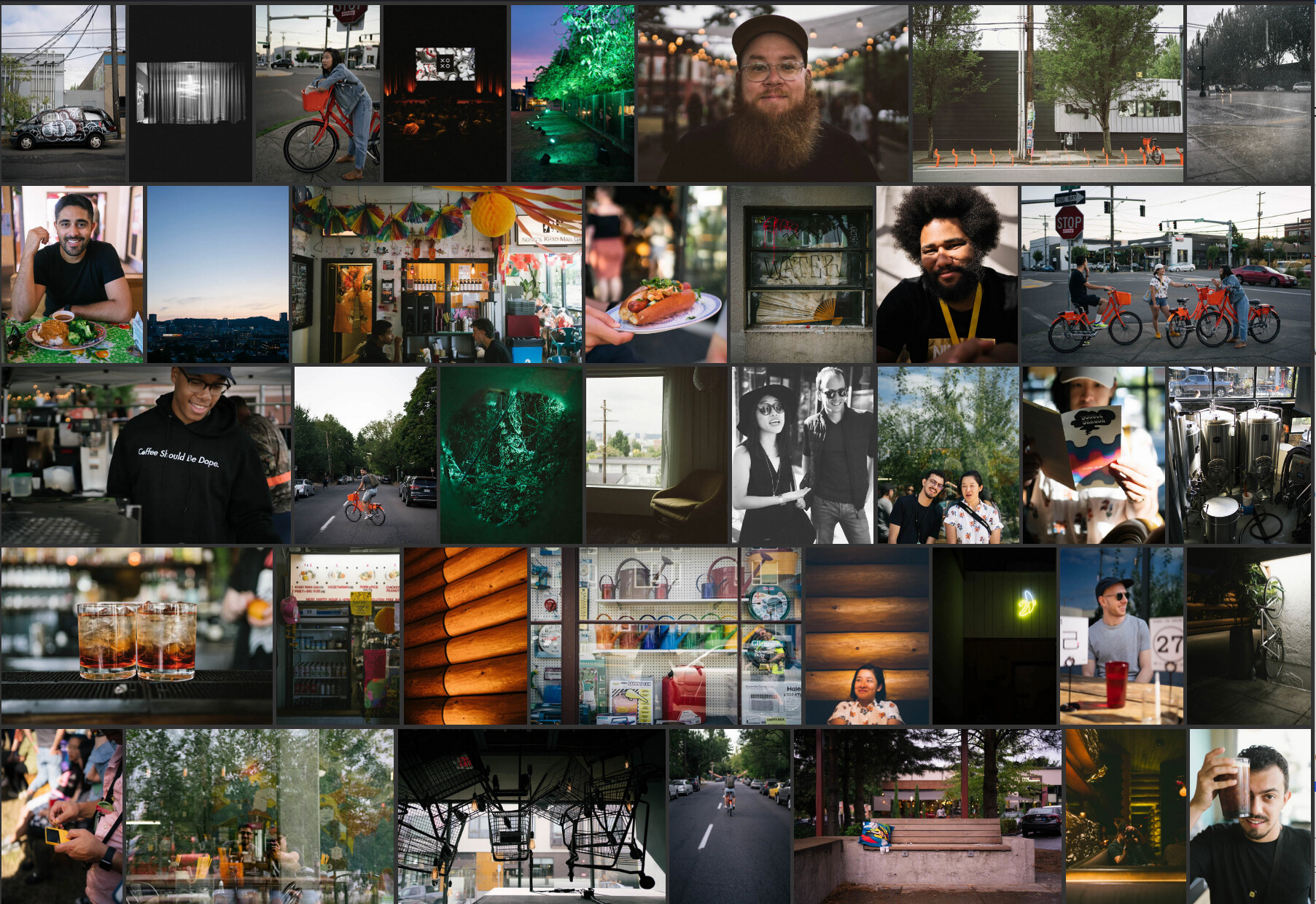
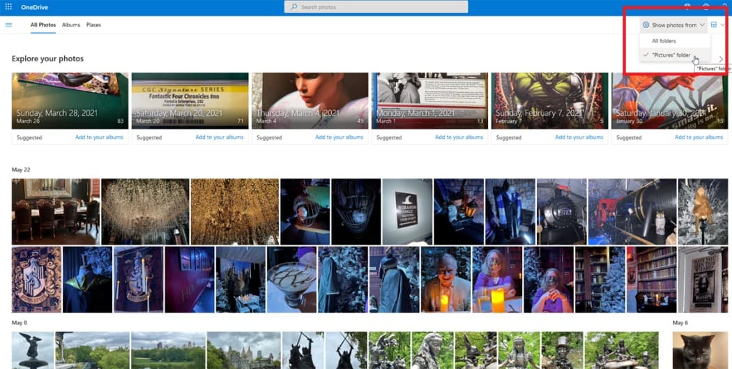
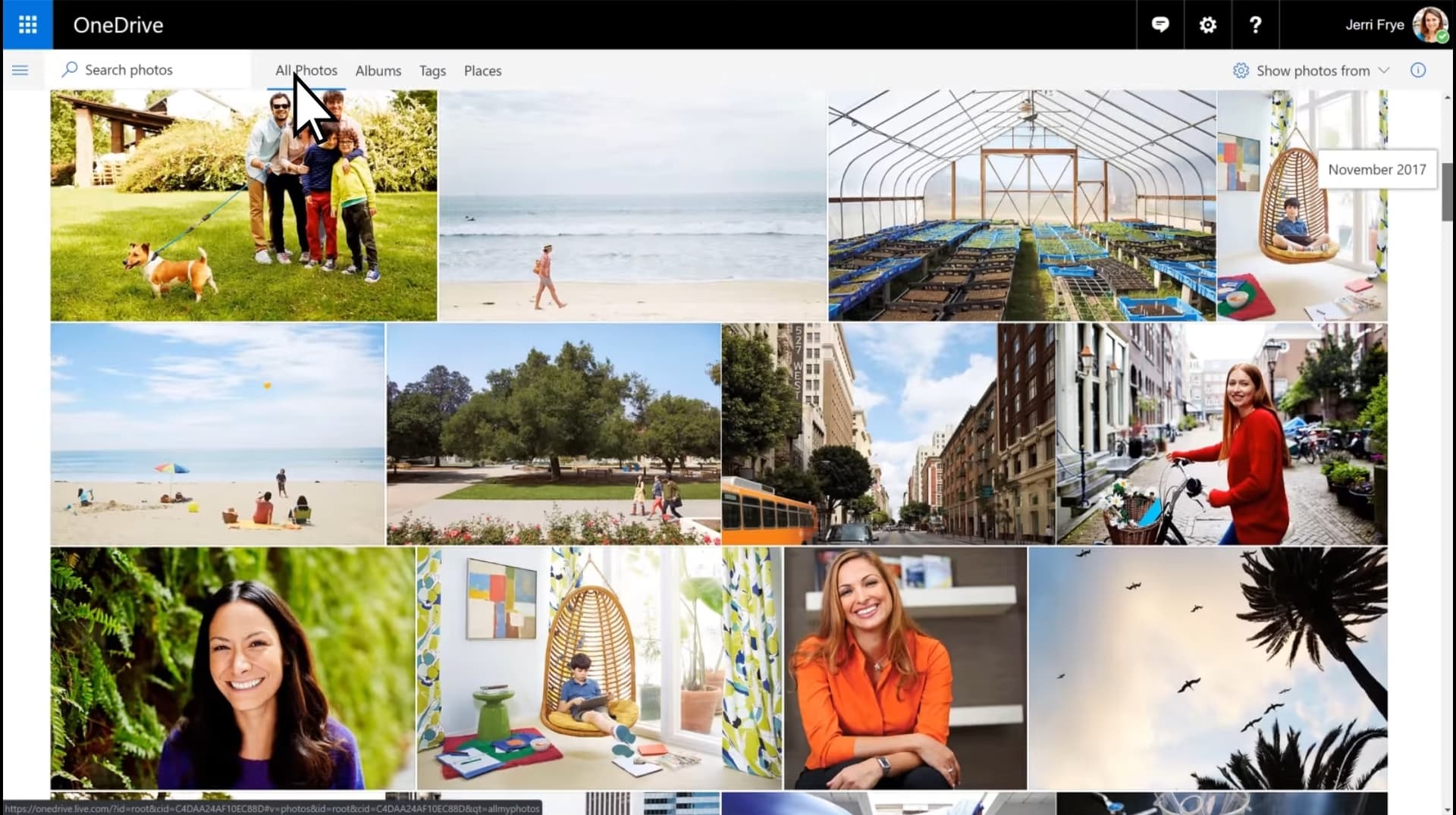
Flexible sizing is important, and square thumbnails may be better for touch interfaces to avoid targets too narrow for easy clicking, but I think it would be awesome to optionally show photos like in OneDrive for web, where thumbnails are shown with ultratall/portrait/square/ultrawide aspect ratios. They are still slightly cropped to maintain even spacing, but to a far lesser extent than square thumbnails. Here’s two screenshots I found on the web to give you some idea, but I’m personally most impressed when I scroll past one of my panoramic photos that takes up an entire row. Unfortunately I couldn’t find an online screenshot illustrating that for you.
Here’s a beautiful exemplar with an exceptionally wide aspect ratio.
The original art is 525×25.5 cm (207×10 in). The Qing Court Version is 1152.8×35.6 cm (37.8×1.2 ft). Those are aspect ratios of 20.6 and 32.4, respectively.
Thanks for that example @nuk ! I don’t suspect many libraries will include 32×1 aspect-ratio images, but landscapes are certainly a thing (and iPhone default landscapes are 4×1, so I expect a bunch of these).
A bunch of work on better CSS support for aspect-ratio and flexbox have made their way to browsers since I originally looked at this–I’ll see if there’s a nice way to get a css-only masonry solution going.

.jpg)