Wordy title sorry, but wasn’t sure how else to put it.
I’ve got all my images meticulously tagged with hierarchical tags, using them for pretty much everything (and avoiding other forms of ‘people’ tagging) which means photostructure is great.
But there is a visual issue that is causing me headaches as I work through some small imports for testing:
when i browse a keyword, e.g.:
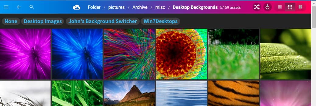
Keywords > Animals > Sealife
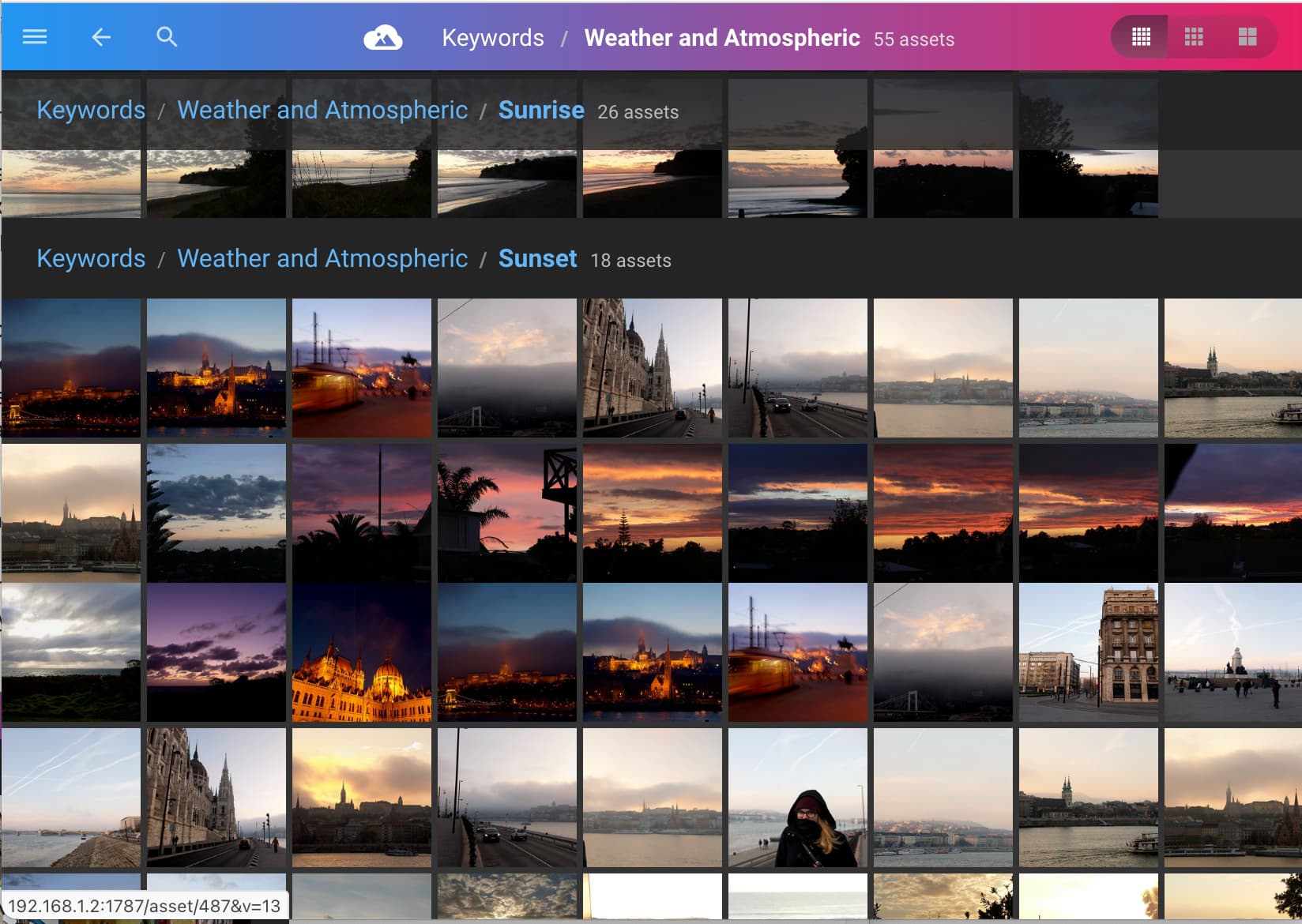
I see the sub-tags under their own headings, but at the end every single image is just blobbed on, attached to the bottom most category. This is identified as a ul of gallery leaf (the ‘proper’ navigation above are a div of class tag-gallery)
I understand WHY they are there, my issue is with the lack of visual separation between the ‘last’ child keyword and the list of all images matching the current one. Visually it becomes very difficult to discern where one ends and the next begins, especially for keywords with a large number of images (common higher up the tree!)
I have two solutions in mind, but curious to know if I’ve just missed something somewhere…
The simplest solution to me is to have a heading as per the existing style with something indicating that it is showing all images containing the current tag, and that this overlaps with the images above. This is somewhat visually redundant, with the purple bar at the top showing the same thing.
My strong preference, though presumably more difficult, would be to do the same as 1. to ensure visual demarcation, but ONLY show images that are not already in a child keyword list above. This feels like a more natural alignment to the logic behind hierarchical structures and would resolve the visual redundancy above, as you could put the images without any further child tags at the top.
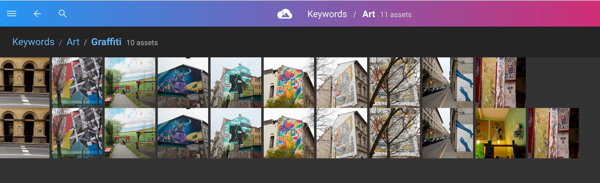
I’ve attached an example where hopefully you can see how the current state makes finding images without child tags nearly impossible and is ambiguous about where one thing ends and the next starts. Having the ‘urinal art’ image at the top on its own would highlight that it is a form of art that I am not able to categorise further, wheras grafitti is fairly clear cut and they are grouped together in a child tag
hmm… I’d be surprised if this was the intended behavior. I think if you’re under “sunset” you should only see pics tagged with sunsets. Not everything else blobbed at the end, with or without separation.
Having said that, I also use hierarchical tags to organize my pics, especially people, where I use
ok, so the second option above ‘solves’ the issue of the excess number of items at the bottom, (which is fine, as it’s cleaner and changing my tagging approach is …fine) but not the issue itself - as per example above, anything with the art keyword (and no child tag) gets weirdly lumped underneath the last child tag rather than making it clear that THESE are the photos that are tagged with this keyword, and no children.
Screenshot shows graffiti followed by a urinal on a wall as art, that I’ve left as ‘art’ as i’d rather not try to classify it, but the visual delineation is …bad:
Same issue for me when browsing by folders. I would expect photos NOT in a subtag/subfolder to be at the very top of the list with no heading breadcrumbs, not at the very end. Note I’m on the latest stable which is pretty old at this point, so this behavior may have already changed in the latest beta/alpha.
Here’s my PhotoStructure on the left, actual folder structure on the right.
sorry for the late reply. You’re correct I only tag the last item in the hierarchy.
So on the remaining issue… I agree this is not good. If you’re in graffiti, you should only see graffiti pics.
That seems like a bug (and not a feature) to me. That’s for @mrm to resolve.
Howdy @davidr , welcome to PhotoStructure! Thanks for the additional context, @nuk and @avdp.
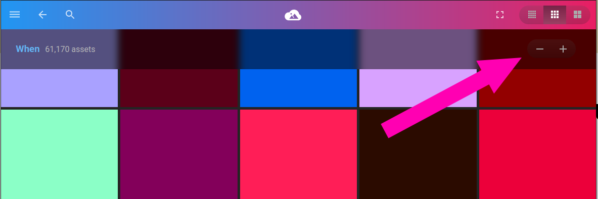
I completely agree that the current rendering needs a demarcation between child tag “samples” and the actual directly-associated assets, so I changed this from “support” to “bug”.
Background
In case you missed it, I wrote up how PhotoStructure extracts keywords:
And how PhotoStructure handles hierarchical tags:
Specifically relevant:
PhotoStructure’s tag hierarchies apply implicit inheritance.
In other words, all path elements within a hierarchical tag must apply to the asset.
If an asset is tagged with Camera/Canon/EOS 5D, PhotoStructure also associates it to Camera/Canon and Camera, via inheritance.
An asset tagged with Where/France/Paris/Louvre must have been taken in Paris, and also taken within France.
Also note:
The assets for child tags are “sampled”, meaning a random selection of relevant assets, and that sample set actually changes size based on thumbnail size.
The assets directly associated to the current tag are not sampled, so you can actually see all the assets.
Issue 1: lack of demarcation between child tag samples and directly-associated assets
If there are child tags and directly-associated assets, I add another “banner” that duplicates the top gradient banner contents to separate the child tag samples and the directly-associated assets
(if any of y’all think of a better approach, I’m all ears!)
Issue 2: handling implicit vs explicit hierarchical tagging
@davidr, if you want to tag everything explicitly, I think that should be handled gracefully by PhotoStructure–should PhotoStructure “collapse” or “aggregate” all “duplicate” tags, so assets tagged with a/b/c, a/b, and a would simply be tagged with a/b/c?
Also–I feel like this should be the default behavior, but happy to discuss.
Issue 1: your proposal would solve my issue, though I’m not sure if i’d prefer the directly associated assets at the top or bottom. Top seems more logical.
Issue 2: I’m torn a bit - the reason for originally including all parent tags was that if I wanted pictures of ‘cars’ i could filter on that. I think the option as described makes lots of sense but I’d want to have the option of not aggregating also. Well, actually I want both!
I think my ideal would be
Directly Associated, with no child tags (Your proposed ‘collapsed/aggregated’ view)
Child Tag 1
Child Tag 2
…
Child Tag N
All photos with this tag, regardless of child tags (the current behaviour, though better visually separated)
OK, on issue 1, I actually misunderstood @davidr, I thought he was seeing /Keywords/Art pics while browsing /Keywords/Art/Graffiti which would have been a bug. Looking at the screenshots again, I see that’s not the case. So yeah, it’s one of those cosmetic issue that essentially renders the view a bit useless…
Update: I poked at the code to add the banner, and, embarrassingly, I’d fixed this last October–it’s been in the v2 alpha builds.
I’d tried it at the top and the bottom. Here’s my thinking:
I have a bunch of child tags to show (and if there are more than what shows on the screen, they are fetched via lazy-loading)
I have a bunch of assets to show (again, lazy-loaded).
Worst case, I suspect much higher cardinality of assets than tags, so scrolling through the handful-or-two of child tags to get to the next section should be easier than scrolling through the possibly-tens-of-thousands of assets.
The other solution could be to “partition” the window into “panes” of child tags, and child assets, but I think that results in an ungainly UX.
The issue of getting to the child assets if a tag also has a ton of child tags will be reduced if you switch to smaller thumbnails, or, in the next build, tap the new “expand” or “compress” buttons in the child tag headers. Reduce them to 1 row, and then scroll to the child asset section.
Concerning issue 1, we’re all in agreement another banner is needed for visual separation. That’s a quick bugfix you already implemented!
I think more time is needed to sort out the rest of the questions/comments, as I think they point to a larger user experience problem. Here’s my first stab at resolving it.
First, a summary of the UX concerns I see above:
@mrm notes that currently assets without children are not sampled (all assets are displayed) but assets with children are sampled (only some assets are displayed). Important because in regular browsing, you always want some way to display all photos.
Display childless assets at the top or bottom? If there are relatively few assets, @davidr and I agree that top is more logical. But if there are very many, it makes more sense to display childless assets at the bottom. In @davidr’s example, if he wanted to look at Honda but had 1000 generic cars, he would have to scroll down 90% of the page before he was able to click on Honda to see those children.
Collapse/aggregate explicit hierarchical tags?@davidr added explicit parent tags in order to see all assets in a group regardless of children, which is only possible in the current PhotoStructure version by adding explicit tags then scrolling to the bottom of the list.
Show/ignore sub-tags?@davidr says sometimes he wants to look at all assets in a group regardless of children, other times he wants to look at all assets in a group separated by children. I definitely want this, too. For example today I might want everything lumped together from my trip to Japan and without differentiating between the 20 cities I visited. But tomorrow I want to see only stuff from my time in Tokyo.
Thinking about all those items as a whole, I think we could satisfy everyone’s wants/needs here with three changes:
No difference between implicit and explicit hierarchical tagging. PhotoStructure treats an asset tagged with a, a/b, and a/b/c as simply tagged with a/b/c.
New “Children” button on the UI next to the existing Small/Medium/Large buttons. Show the current PhotoStructure view when on by default. Disable to mix all photos together at the current hierarchy level regardless of children – ignore both which child the asset has, and whether the asset has any children at all. When disabled, the separate banners for each child tag are removed and all available child tag are listed in a single banner at the top.
New “Shuffle” button to show the current PhotoStructure view when on by default. Disable to stop all sampling/aggregation/shuffling of assets, so all assets are shown and in order. Note assets at the current tag without children are still never sampled, so you can still actually see all the assets at that level, matching the current behavior.
With those new UI buttons, @davidr would no longer need explicit hierarchical tags (but also doesn’t have to delete them if he’s already added them everywhere). To view pictures of ‘cars’, he sets Children=OFF and leaves Shuffle=ON. He also wants the option of not aggregating, so for that he sets Shuffle=OFF (and either leaves Children OFF or turns it back ON depending on his desires for that day).
When dedicating time to organizing my photos, I would turn Children=ON and Shuffle=OFF. When focusing more on enjoying my photos, I would turn Shuffle=ON and toggle Children depending on mood/area of interest/etc.
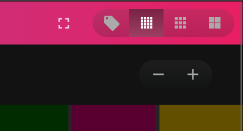
Here’s a mockup with Shuffle=ON and Children=OFF, and the proposed tag bar that appears with children=OFF:
Issue 1:
Glad to hear it’s in the next version - I heeded the warnings and didn’t experiment with the beta/alpha this morning. I’d be ok with the ‘all/no children tags’ at the top if it was in the same form where you can ‘dive in’, but that would break the existing paradigms, so bottom probably makes sense. Maybe a toggle to collapse/uncollapse child tags for people that have too many?
Issue 2:
Perhaps a simpler version of this issue would be a UI toggle in the “all” header at the bottom where toggling would switch between:
“a car tag with no children” (Default)
“everything with a car tag”
e.g.:
Cars/Honda
Cars/Toyota
[Cars with no children|All Cars]
I’m not keen on the using “Children” or “Shuffle” in any labels though, as children is bad for “normal people” to parse (imagine this under the ‘who’ tag!) and shuffle has connotations that this doesn’t deliver to. I am bad at coming up with good (non-verbose) names though.
@nuk: as an engineer, I like the shuffle and child tags visibility toggles!
I suspect @davidr is correct though, about those adding cognitive complexity. I’ve never seen that sort of thing in an image gallery before. Yes, I know PhotoStructure’s tag gallery is already unique, but I (hope) that people “grok” what’s going on (ish), at least enough to click around to get to the photos they want to view.
Another approach could be to add the “child toggle” functionality as a different thumbnail size, something like:
or
If you just want to view child assets, know that you can click the search icon in the header which will pre-populate the search field with that tag. You can then sort by captured-at time in ascending, descending, or last-imported time.
I’ve implemented a new omitAncestorTags setting that defaults to true. Here’s the description:
PhotoStructure’s hierarchical tags assume implicit inheritance: that is, if you tag an asset with “nature/sky”, “nature” is implicitly assumed.
If this setting is true, PhotoStructure will omit tags that are already inferred from deeper descendant tags–that is, if an asset is tagged with “nature/sky” and “nature”, and this setting is true, the “nature” tag will be omitted.
I didn’t think too hard about the particular buttons and labels – it’s the functions themselves that I think are important. The functions to toggle sampling and to toggle grouping.
The omitAncestorTags setting makes sense to me.
@mrm, Good point that searching already lets you toggle off grouping. In @davidr’s example, clicking the search icon prepopulates search with kw:cars to show all assets ignoring children. Modifying to kw:=cars shows only assets with no children. Modifying to kw:cars/* shows only assets with children. Perfectly functional already, with reasonable documentation to figure it out and plans for a better search interface in the future.
But your child toggle looks good to me, too. A “child” icon could certainly be confusing, where your “tag” icon is less ambiguous. And if someone clicks it, I think the difference is immediately obvious and intuitive.
I still think it’d be nice to be able to toggle sampling/shuffling in regular browsing and in searching. For when I’m enjoying vs specifically organizing. Bulk asset modifications would be easier to do with sampling disabled. But I guess that’s a different feature request than what this thread is about.
I’m totally sold on the value of showing child tags as a list of “bubbles” like you prototyped. This would be quite handy for very large child tag cardinalities.
I’m not sold on toggling sampling, though. What assets would I show for a given child tag? The N most recent, or N oldest? Or are you thinking that the sampling toggle would only impact the assets directly associated to the current tag?
(I had that edit in draft mode with the UI sample, but then I saw your reply… and that I hadn’t clicked “save”…)
Toggling sampling off would show all assets for all children, so you can actually see all the assets regardless of children. Or maybe just show the first X assets for each child then include a + button to expand and show assets for only that particular child.
Considering a personal example, I have a “family” folder (tag) with a mix of subfolders (children) arranged variously by event, date, and other less-than-ideal stuff. I recently wanted to find all pictures of my mom. To actually see all of the assets under “family”, I clicked through every single child separately, since that’s the only time PhotoStructure doesn’t sample.
It never occurred to me to search as you taught me today. I think that’s because I’ve only gotten about 50 photos tagged so far, and searching feels completely useless until all my photos actually have keyword tags on them.
Consider another case as well, although this one is weaker imo. Should the proposed “tag”/“child” button show assets as sampled or not? I’d prefer sampled when walking down memory lane, but if I suddenly notice some photos where I’d like to update some tags, I’d want to immediately disable sampling so I can see all related assets and start organizing.
Those are interesting use cases for the find-your-mom case. I’ll think about that.
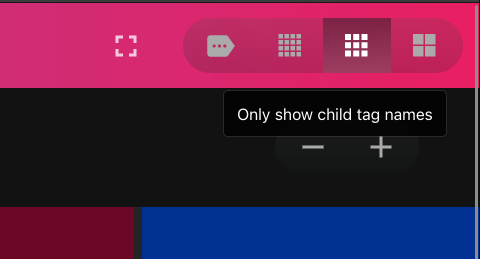
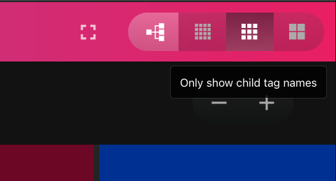
You’re correct about the hashtag icon. This may be a case where I want to use an icon that hints at something recognizable, but is still something new. Maybe this?
It’s a mashup of the gmail label icon and a very simplified view of “label bubbles” (the dots in the middle). The iconography might be a bit too obscure though.
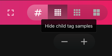
This icon is toggling off the child tag sample galleries/toggling on “only see child tag names”, so the tree seems like it might not be quite the correct icon–it’s certainly descriptive of what’s being changed, but it doesn’t lean into what’s changing. Here’s the mockup:
I could see people arguing that it should toggle child tag visibility, rather than just how the child tags are being rendered.
Concerning the sampling, on/off could be done with a dice icon instead of the shuffle icon. (Assuming you do decide to try adding it, and put it on the main header rather than a submenu somewhere). (@davidr didn’t like shuffle due to other connotations it suggested to him).
Concerning the child display, do you think your mockups indicate what’s changing? To me, your tag/label icon variations scream “click me to edit tags”.
But I’m just one person, and what’s in my head doesn’t always match reality for the general public. Maybe you could use the label and reduce my association with editing by showing two icons.
As you have three buttons to toggle between small/medium/large pictures, you could have two buttons to toggle between a single tag and multiple tags. Sorry I’m not at a computer where I could make a mockup, but these are the two icons I’m thinking:
I realized that the child-tag-rendering toggle can’t be part of the thumbnail size button group–thumbnails are shown both for child tag samples and for directly-related assets.
I’m going to put the “show child tags as bubbles” feature on hold for a bit, at least until v2.1 is released. I’ll think more about a shuffle toggle, too.